Get a sharp print, every time
A quick, practical guide to vector vs. raster graphics, image resolution, and how to prepare files that look great at large format — plus why "just make it with AI" can quietly ruin a print.
Vector vs. raster: what's the difference?
Every graphic is one of two things. Knowing which you have is the single most important step toward a clean large-format print.
-
Vector graphics
are built from math — points, lines and curves. They can be scaled to
the size of a building and stay perfectly crisp. Logos, text and icons
should always be vector.
Typical files: %code.text-body PDF, SVG, AI, EPS
-
Raster (bitmap) graphics
are made of a fixed grid of pixels. Photographs are raster. Enlarge one
past its native size and the pixels become visible — soft, blocky edges.
Typical files: %code.text-body JPG, PNG, GIF, PSD

Resolution: low-res vs. high-res
Resolution is how many pixels pack into each inch of print (DPI/PPI). Too few pixels for the printed size and your artwork looks soft, jagged or blurry. Here's the same logo at print quality versus too-low resolution — printed large, the difference is impossible to miss.
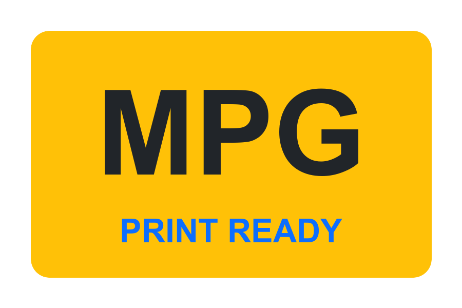
High resolution (300 DPI)
Clean lines, legible text, smooth color. This is what your customers will see up close.
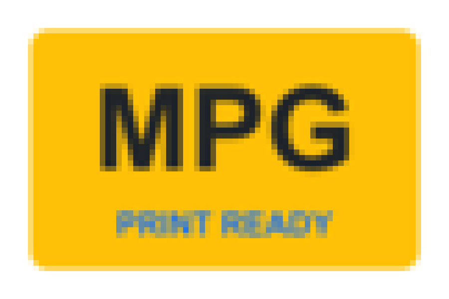
Low resolution (upscaled)
Fuzzy edges and unreadable small text. Enlarging a small image can't add detail that was never captured.
How much resolution do I need for large format?
Big prints are usually viewed from further away, so they need fewer dots-per-inch than a business card. Use this as a rule of thumb for the %em finished print size:
| Product | Typical viewing distance | Target resolution (at final size) |
|---|---|---|
| Stickers & small decals | Held in hand | 300 DPI |
| Posters & technical prints | 1–3 ft | 150–300 DPI |
| Retractable banners / displays | 3–6 ft | 100–150 DPI |
| Large outdoor banners | 10 ft+ | 72–100 DPI |
Best of all: supply your logos and text as %strong vector so resolution stops being a worry entirely.
How to prepare your artwork
Six checks that prevent 90% of print problems.
Build at final size (or to scale)
Set your document to the actual print dimensions — or an exact fraction (e.g. 1:10) at higher DPI. Avoid stretching a small file to fit.
Add bleed & a safe margin
Extend background color ~0.25" past every edge (bleed) so trimming leaves no white slivers, and keep important text/logos ~0.25" inside the edge.
Use CMYK color
Printers use CMYK inks, not RGB screens. Convert to CMYK so the colors you approve are the colors that print — bright RGB blues and greens can shift.
Outline or embed your fonts
Convert text to outlines (or embed fonts in the PDF) so your typefaces don't substitute to something else on our end.
Embed images at full resolution
Make sure linked photos are embedded and meet the resolution targets above. A 72-DPI web image won't hold up enlarged.
Export a print-ready PDF
A high-quality PDF with vector elements intact is the safest format. It keeps text crisp and bundles everything in one file.
Bleed, trim & safe area at a glance
- Bleed: artwork that gets trimmed off — prevents white edges.
- Trim: where we cut. Your finished size.
- Safe area: keep text & logos inside this line.
Using AI designs without a professional? Proceed carefully.
AI image tools are great for brainstorming — but the files they produce are almost never print-ready. Here's what tends to go wrong when an AI-generated picture goes straight to a large-format printer.
Low, fixed resolution
Most AI tools output small raster images (often ~1024px). Blow that up to banner size and it falls apart — and there's no high-res original to fall back on.
Garbled, misspelled text
AI frequently renders nonsense letters or warped words. At 10 feet wide, a typo in your headline is very public.
No vector / no layers
You get a flat picture, not an editable logo. Colors can't be matched to your brand, and elements can't be separated or rescaled.
RGB colors that shift
AI art is built for screens (RGB). Converted to CMYK for print, those vivid colors can come out duller or different than expected.
Artifacts & weird details
Extra fingers, melted edges, smudgy logos — small on a screen, glaring on a wall.
Copyright & brand risk
Ownership of AI output can be murky, and it may echo styles or marks you don't have rights to use commercially.
Ready to print?
Upload your artwork and we'll generate a preview so you can check it before you order.